About
About
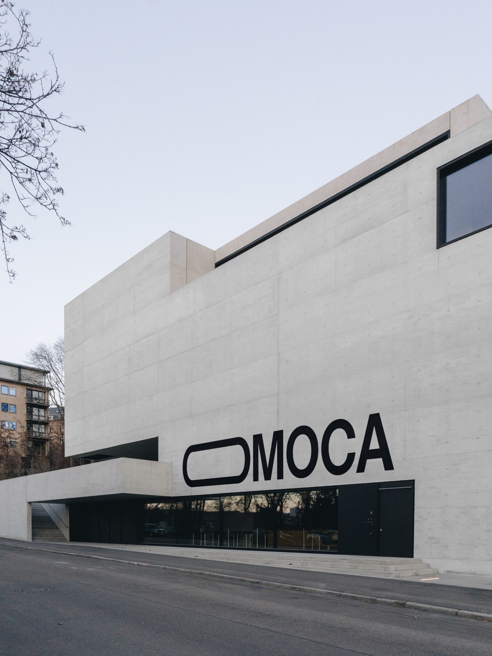
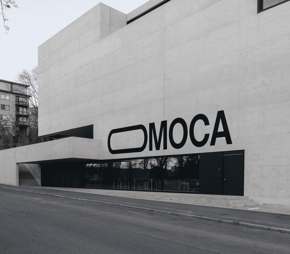
OMOCA, the Orris Museum for Contemporary Art, is a fine art institution located in San Francisco. It is the first museum for Real Art, and acts as a bridge for art and technology. This project brief called for a comprehensive brand identity system, and web experience.
OMOCA, the Orris Museum for Contemporary Art, is a fine art institution located in San Francisco. It is the first museum for Real Art, and acts as a bridge for art and technology. This project brief called for a comprehensive brand identity system, and web experience.
Web and brand design
Web and brand design
2025
2025
Approach
Approach
OMOCA considers itself to be a forward-thinking fine art institution. This museum needed a strategy and identity system that would evoke the same emotions viewers feel when viewing the art in its gallery spaces. What stuck out to me is this institution's belief in the complex and layered meaning behind contemporary art, which drove my initial position and strategy design.
OMOCA considers itself to be a forward-thinking fine art institution. This museum needed a strategy and identity system that would evoke the same emotions viewers feel when viewing the art in its gallery spaces. What stuck out to me is this institution's belief in the complex and layered meaning behind contemporary art, which drove my initial position and strategy design.
Position & Strategy
Position & Strategy
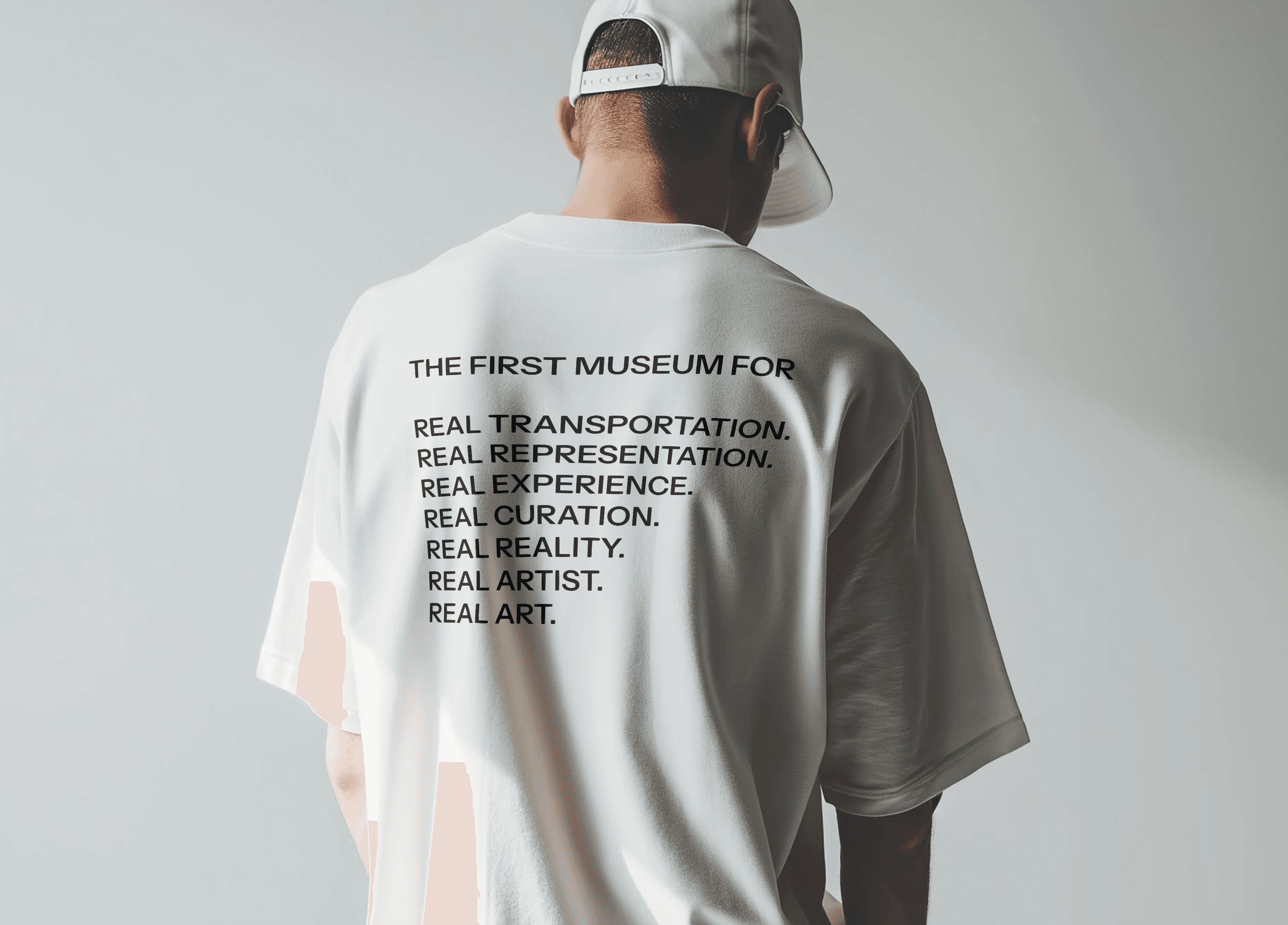
With an approach established to drive my direction, the museum's business strategy was designed around the ideas of bridging art and technology and the complexity of creating and curating new media art. The institution would be positioned as an authority on what it deemed to be "Real Art" — defined as art that is made with the most advanced forms of technology available to a given artist. This also established nomenclature for other operations.
With an approach established to drive my direction, the museum's business strategy was designed around the ideas of bridging art and technology and the complexity of creating and curating new media art. The institution would be positioned as an authority on what it deemed to be "Real Art" — defined as art that is made with the most advanced forms of technology available to a given artist. This also established nomenclature for other operations.
Naming & Identity
Naming & Identity
Research for a name was two-fold. First, phonotactic principles of the English language necessitated a name that was easy to pronounce at a glance. Secondly, the name had to reflect one of two business positions: A) this museum is a bridge for art and technology, or B) the complex meaning behind contemporary and new media art.
After much research and consideration, the full name of Orris Museum of Contemporary Art was chosen. The name reflects the complex and layered meaning of contemporary art, and the acronym adheres to the phonotactic principles that govern the English language.
Landing Page
Landing Page
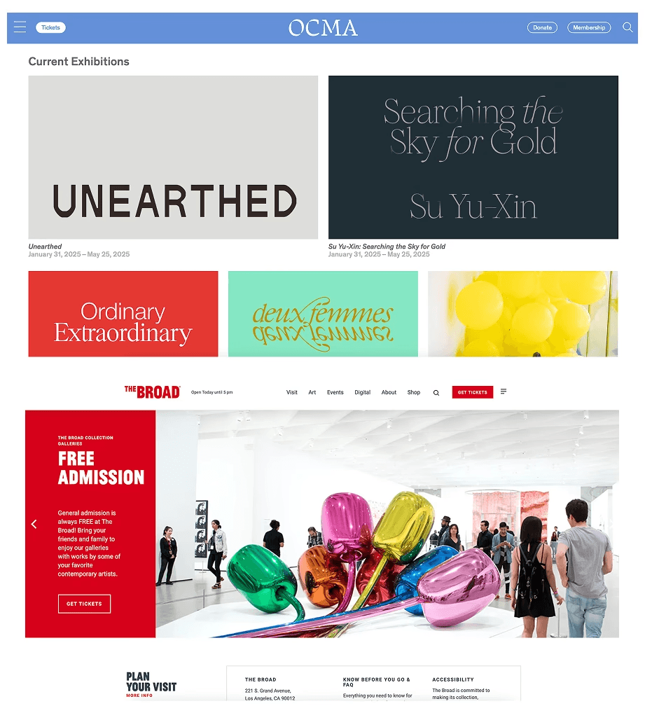
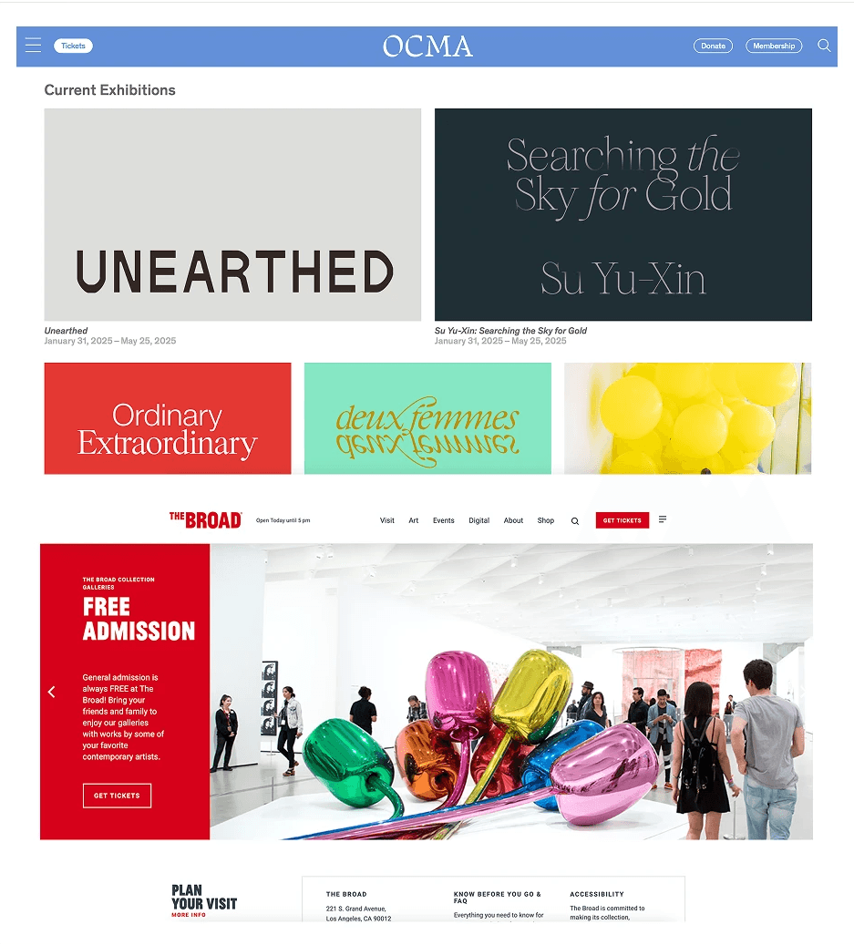
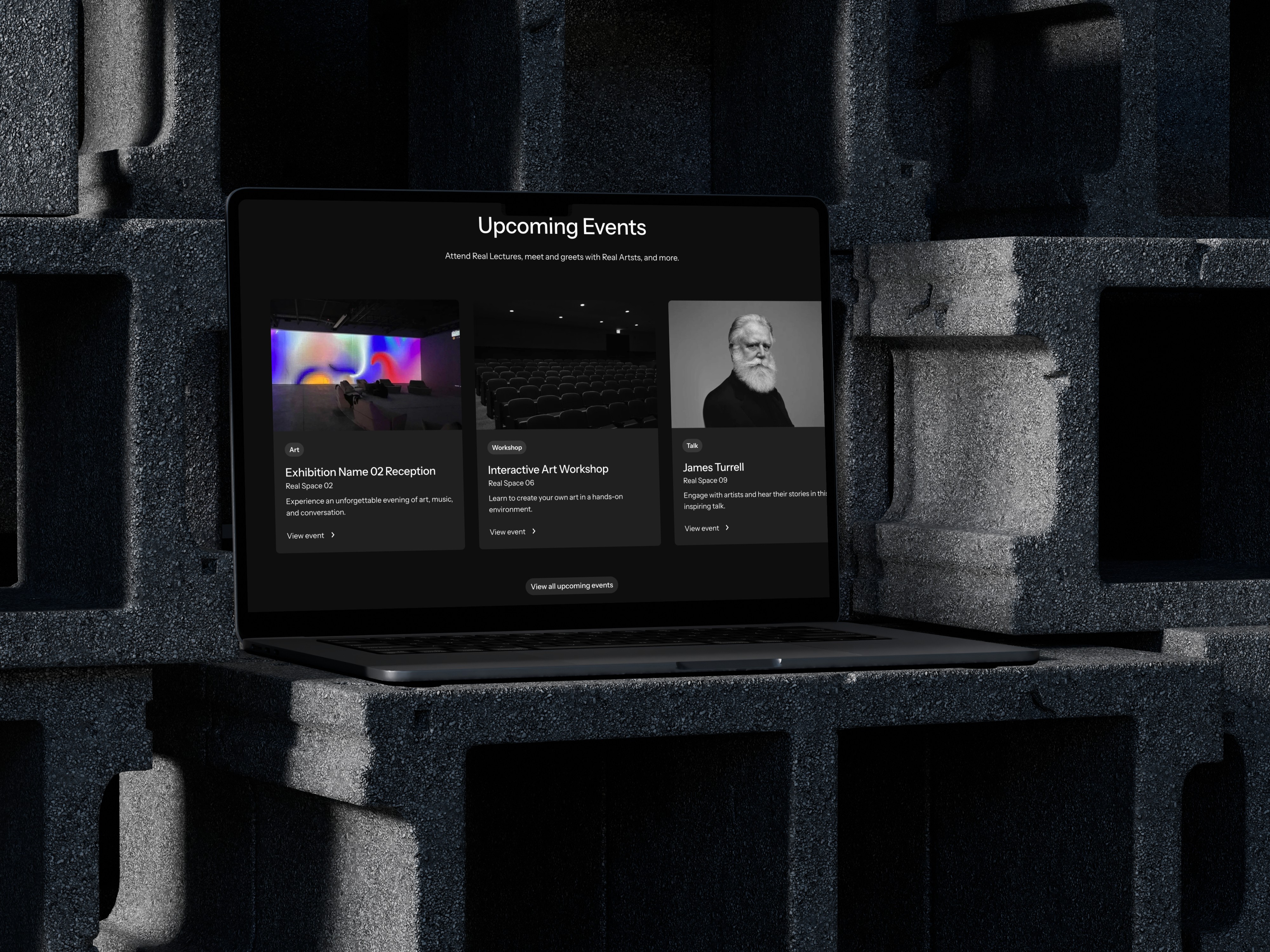
With the core identity assets defined and guidelines in-process, research began on the landing page prototype. This included establishing an information hierarchy based on our strategy, writing user flows based on a larger site-map, and cataloging the content of competing landing pages such as OCMA and The Broad in Los Angeles, CA. Full prototype coming soon.
With the core identity assets defined and guidelines in-process, research began on the landing page prototype. This included establishing an information hierarchy based on our strategy, writing user flows based on a larger site-map, and cataloging the content of competing landing pages such as OCMA and The Broad in Los Angeles, CA. Full prototype coming soon.
Development
Development
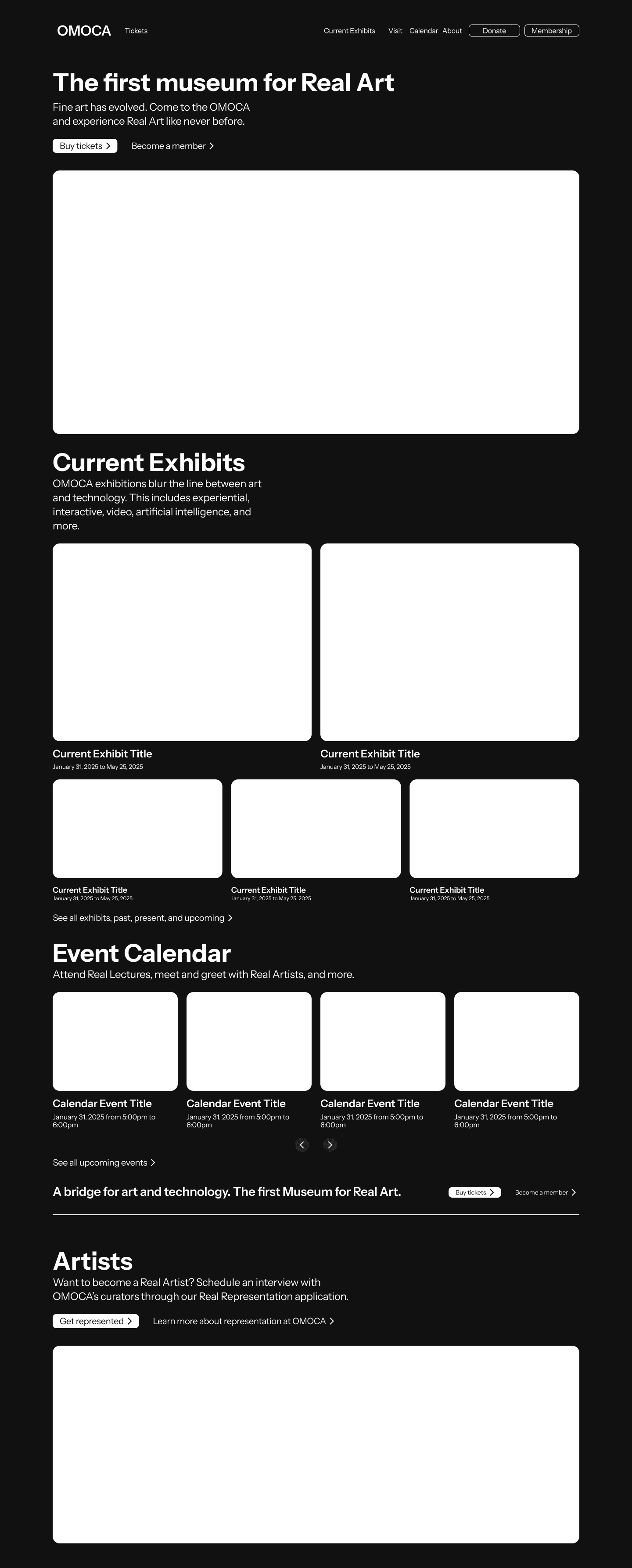
A sitemap was developed based on the strategy and position of the museum (landing page only shown). The information hierarchy is based on the strategy and position of the museum.
Scroll to view.
A sitemap was developed based on the strategy and position of the museum (landing page only shown). The information hierarchy is based on the strategy and position of the museum.
Scroll to view.
A sitemap was developed based on the strategy and position of
the museum (landing page only shown). The information hierarchy is based on the strategy and position of the museum.

Design
Design
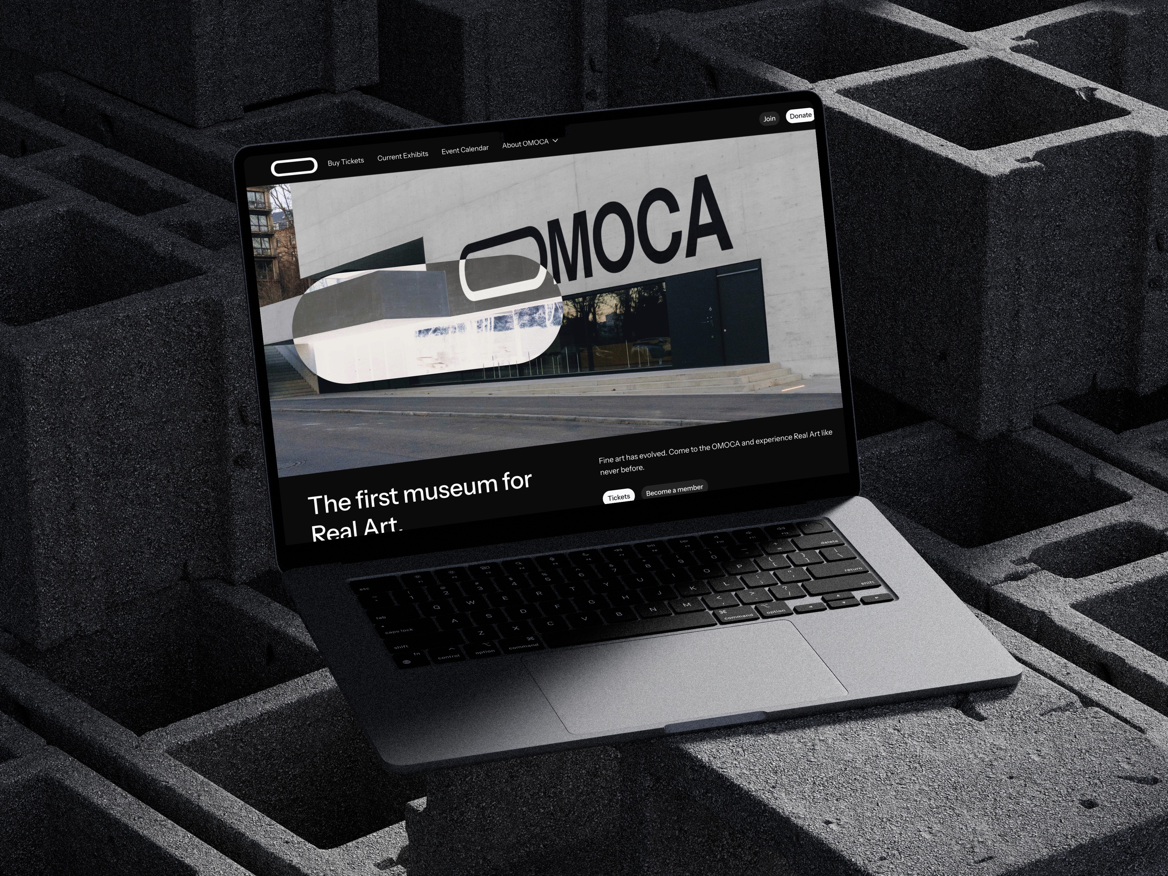
Prototype demos are currently in process and coming before April 2025. On display is a screenshot of an initial design concept with an exlusion overlay version of 'The O' logo being used as a mouse follow component.
Prototype demos are currently in process and coming before April 2025. On display is a screenshot of an initial design concept with an exlusion overlay version of 'The O' logo being used as a mouse follow component.
Guides
Guides

Visual Identity
Visual Identity
OMOCA
OMOCA
OMOCA
OMOCA
OMOCA
OMOCA
OMOCA
OMOCA
OMOCA
OMOCA
OMOCA
OMOCA
OMOCA
OMOCA
OMOCA
OMOCA
OMOCA
OMOCA
OMOCA
OMOCA
OMOCA
OMOCA
OMOCA
OMOCA
OMOCA
OMOCA
OMOCA
OMOCA
OMOCA
OMOCA
OMOCA
OMOCA
OMOCA
OMOCA
OMOCA
OMOCA
Instrument
Sans
Instrument Sans Regular
ABCDEFGHIJKLMNOPQRSTUVWXYZ
abcdefghijklmnopqrstuvwxyz
1234567890
Instrument Sans Medium
ABCDEFGHIJKLMNOPQRSTUVWXYZ
abcdefghijklmnopqrstuvwxyz
1234567890
Instrument Sans Bold
ABCDEFGHIJKLMNOPQRSTUVWXYZ
abcdefghijklmnopqrstuvwxyz
1234567890
Instrument Sans is a font designed for the Instrument brand. It's a variable sans-serif which balances an abundance of precision with subtle notes of playfulness. Inspiration was drawn from our enduring interest in neo-grotesques. In a way, this family of weights, widths, and italics represent an orchestration of all of our favorite qualities in a sans-serif.
Instrument Sans is a font designed for the Instrument brand. It's a variable sans-serif which balances an abundance of precision with subtle notes of playfulness. It was chosen to represent OMOCA because of its sharp terminals and objectivity grounded in geometric shapes.
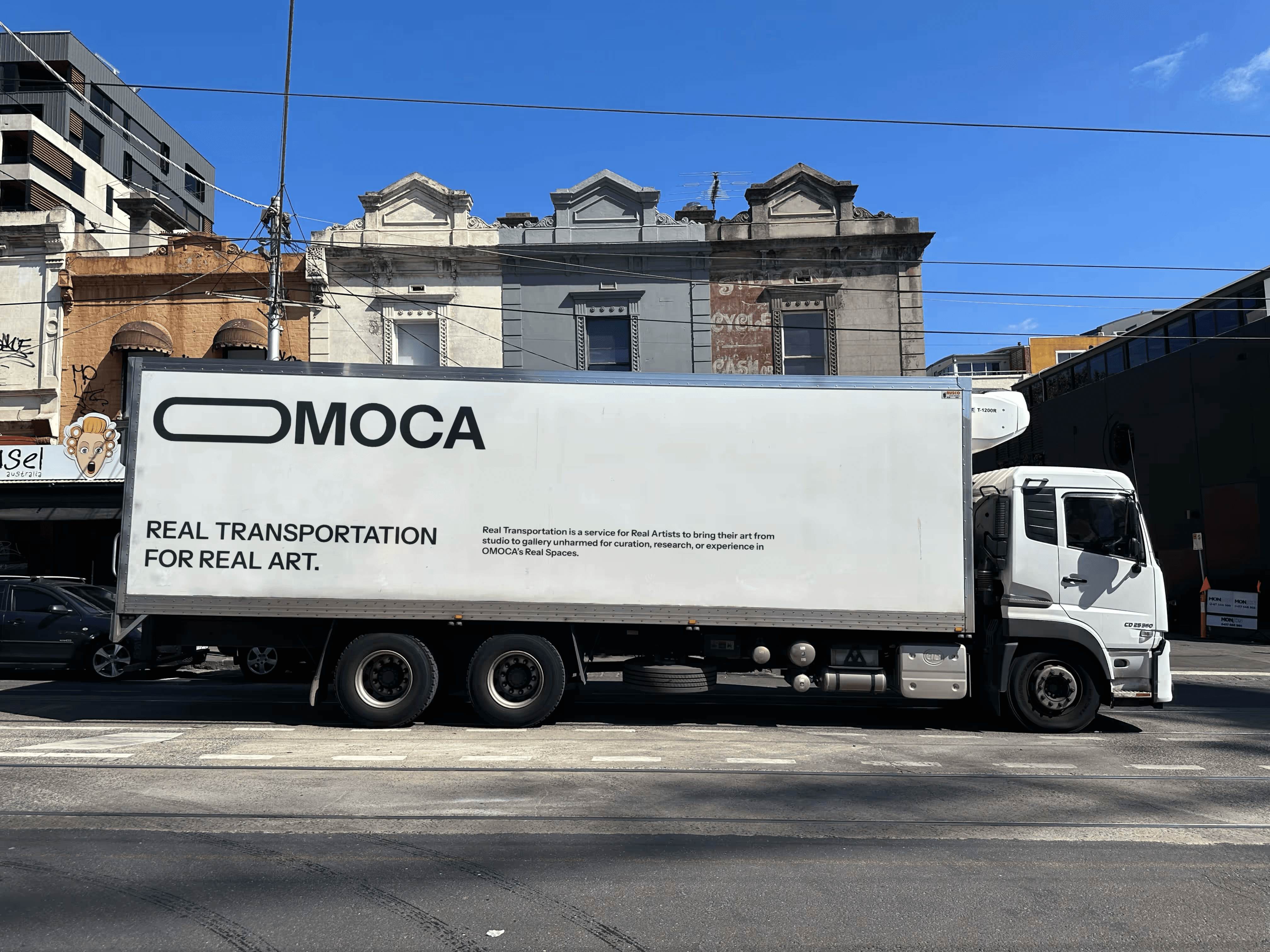
OMOCA's primary icon was developed out of what is the most objective letter in the English alphabet: The letter O. "The O," as it is now referred to, is triple the length of the letter, symbolizing the creativity and objectivity of Real Art, and establishes a foundation for a dynamic identity.
OMOCA's primary icon was developed out of what is the most objective letter in the English alphabet: The letter O. "The O," as it is now referred to, is triple the length of the letter, symbolizing the creativity and objectivity of Real Art, and establishes a foundation for a dynamic identity.
Real Black
#01070E
Real Grey
#E2E2E4
Blue Light
#0066FF
Real White
#F9F9FB
Real White was chosen to represent OMOCA, with the rest of the Primary Color Palette following the same Real Art nomenclature. The exception to this rule is Blue Light, which was named after the light emitted by display technology. This is a reflection of the new media contemporary art which is displayed in OMOCA's gallery spaces.
Real White was chosen to represent OMOCA, with the rest of the Primary Color Palette following the same Real Art nomenclature. The exception to this rule is Blue Light, which was named after the light emitted by display technology. This is a reflection of the new media contemporary art which is displayed in OMOCA's gallery spaces.