About
About
The Atlantic consdiers itself the finest literary magazine in the English speaking world, and rightly so. After 167 years of print magazines, it feels a brand and strategy refresh is long overdue. The challenge is to position one of the oldest publications still running in America to appeal to a contemporary market without sacrificing the equity of its storied history.
The Atlantic consdiers itself the finest literary magazine in the English speaking world, and rightly so. After 167 years of print magazines, it feels a brand and strategy refresh is long overdue. The challenge is to position one of the oldest publications still running in America to appeal to a contemporary market without sacrificing the equity of its storied history.
Disciplines
Disciplines
Web and brand design
Web and brand design
2024
2024
Approach
Approach
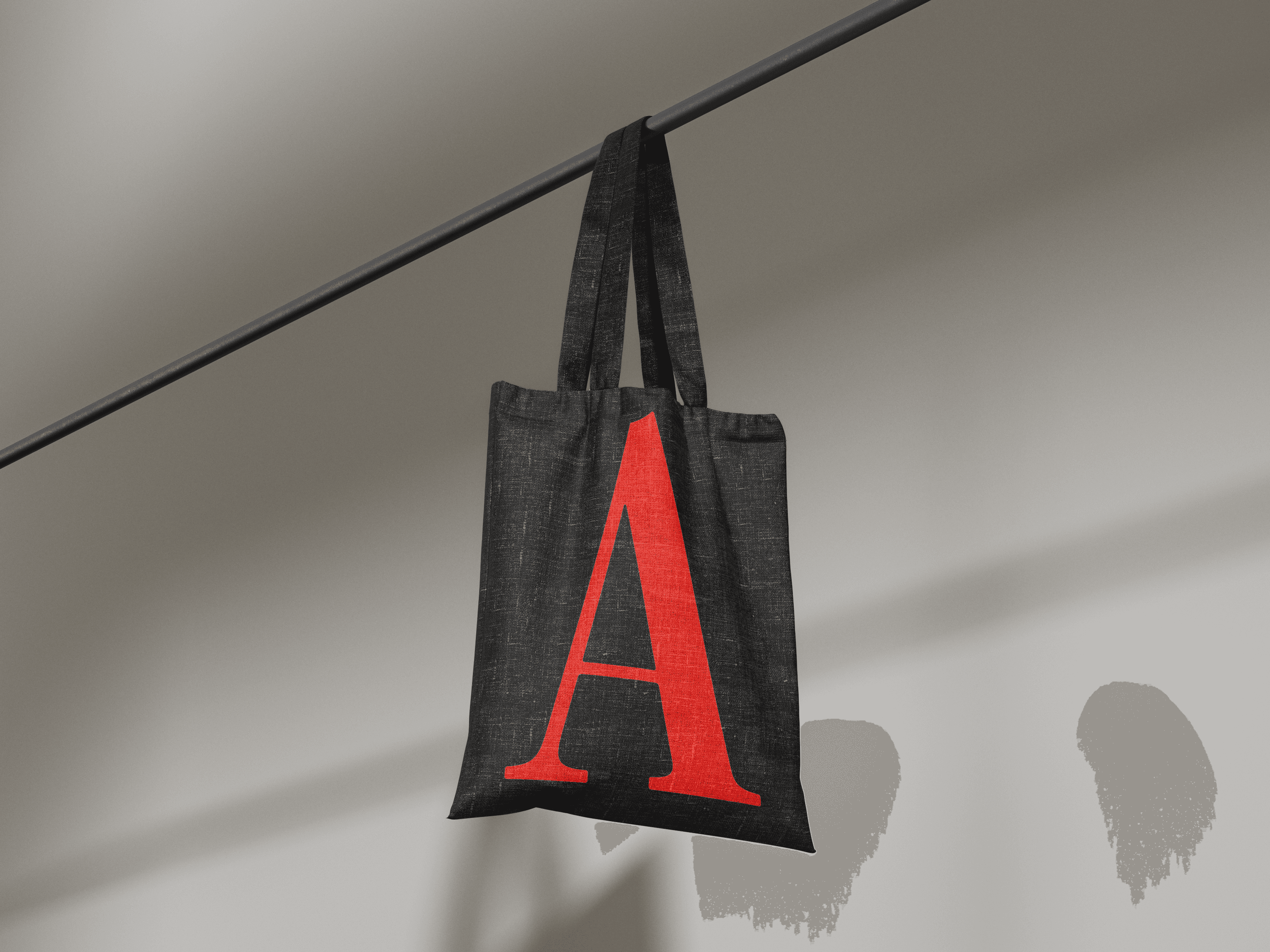
The Atlantic has become synonymous with the Scarlet A in recent years. I proposed amplifying the voice of its core visual assets even more through a refresh of The Atlantic's visual identity.
The Atlantic has become synonymous with the Scarlet A in recent years. I proposed amplifying the voice of its core visual assets even more through a refresh of The Atlantic's visual identity.
Development
Development
Centering the brand even more heavily around the Scarlet A gave an edge to the brand sure to resonate with a younger and contemporary audience. More images coming soon.
Centering the brand even more heavily around the Scarlet A gave an edge to the brand sure to resonate with a younger and contemporary audience. More images coming soon.
User Interface
User Interface
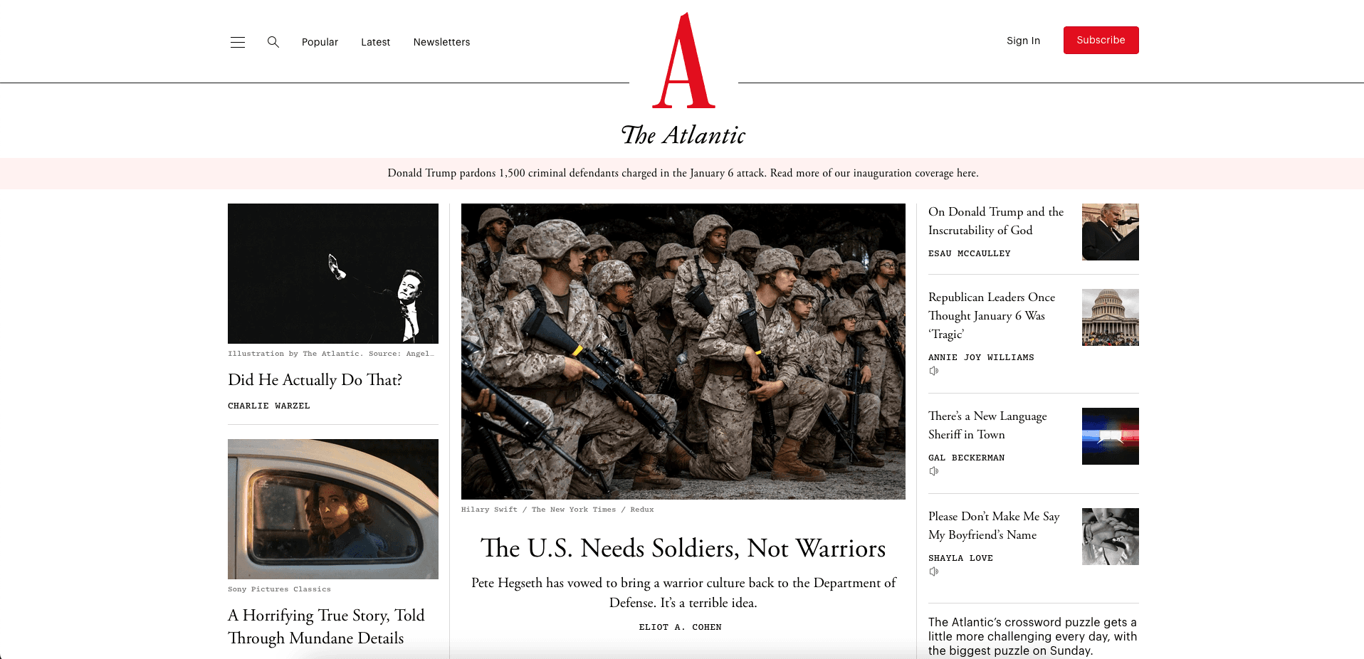
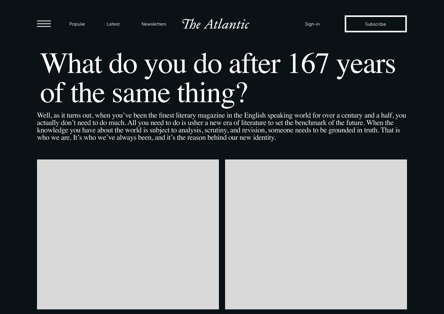
With a striking visual identity, The Atlantic needed a user interface to match. The interface design would need to feel similarly striking, with an experience that mirrors contemporary technology and design culture to provide a foundation for reaching young and technologically-minded users.
With a striking visual identity, The Atlantic needed a user interface to match. The interface design would need to feel similarly striking, with an experience that mirrors contemporary technology and design culture to provide a foundation for reaching young and technologically-minded users.
Development
Development
By iterating on wire frames through live feedback cycles, I was able to establish a landing page that bridged the goals of maintaining focus on The Atlantic's writing with a proper introduction to both the new visual identity and the accompanying campaign for the purpose of greeting OOH viewers with a sense of familiarity for as long as the campaign was active.
By iterating on wire frames through live feedback cycles, I was able to establish a landing page that bridged the goals of maintaining focus on The Atlantic's writing with a proper introduction to both the new visual identity and the accompanying campaign for the purpose of greeting OOH viewers with a sense of familiarity for as long as the campaign was active.

Design
Design
The design of this website was made possible by The Atlantic's visual refresh. Art direction for both the brand and this website were centered around the Scarlet A that has become synonymous with the brand. Hits of red against the neutral tones of the entire site were designed to build an association with that color for the brand in the mind of the user. Demo preview coming soon.
The design of this website was made possible by The Atlantic's visual refresh. Art direction for both the brand and this website were centered around the Scarlet A that has become synonymous with the brand. Hits of red against the neutral tones of the entire site were designed to build an association with that color for the brand in the mind of the user. Demo preview coming soon.
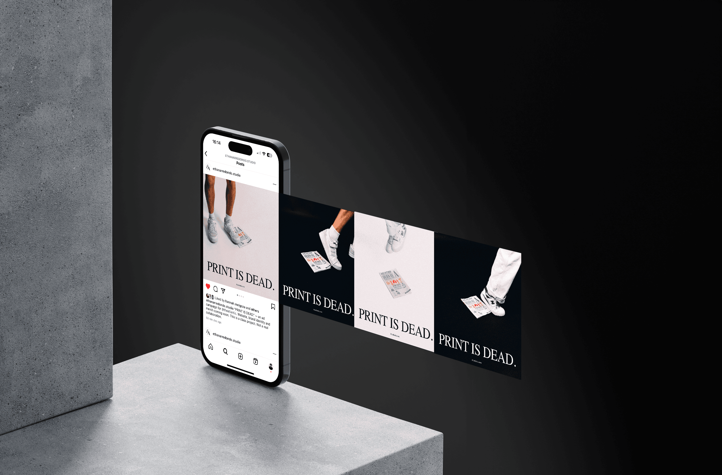
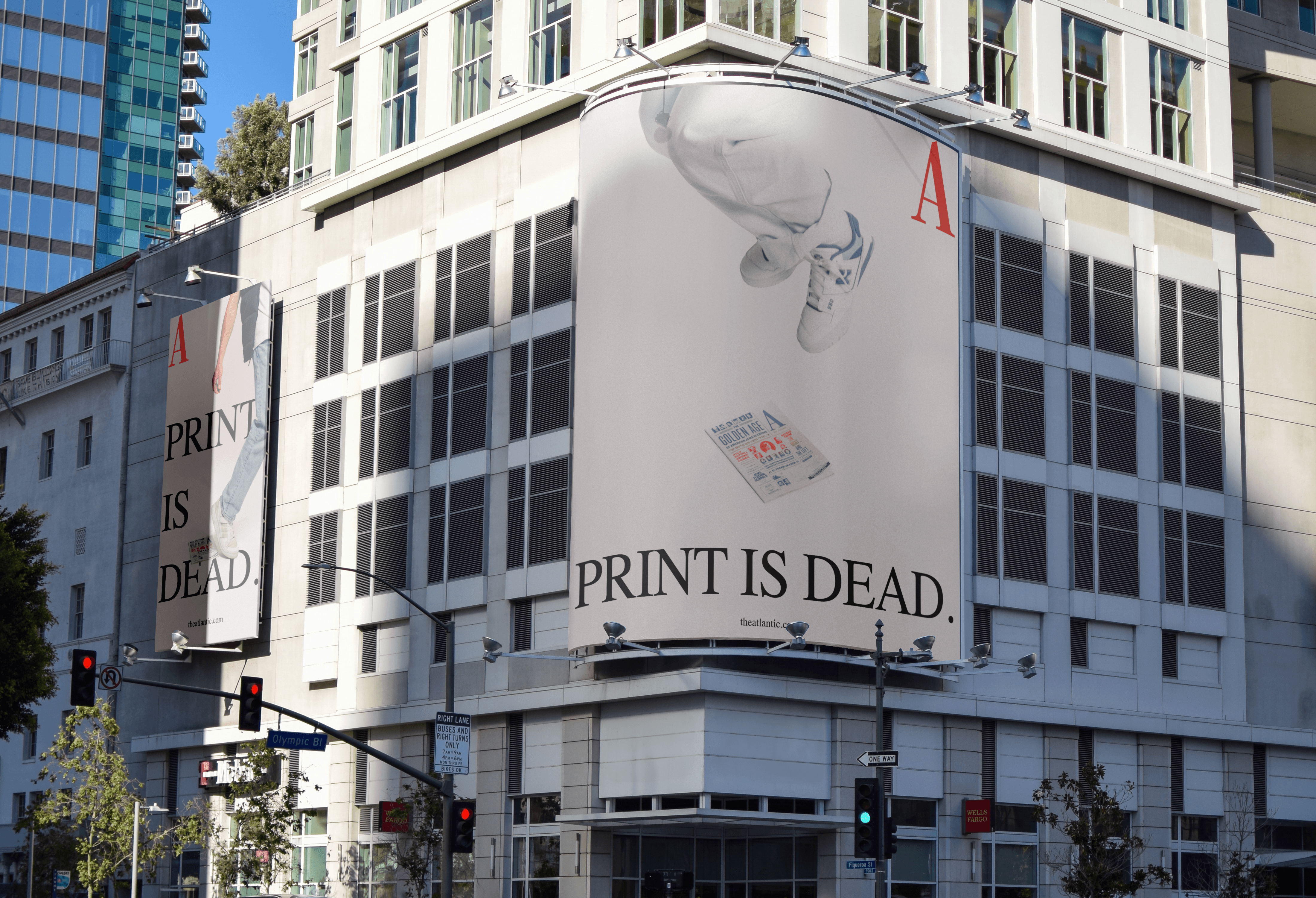
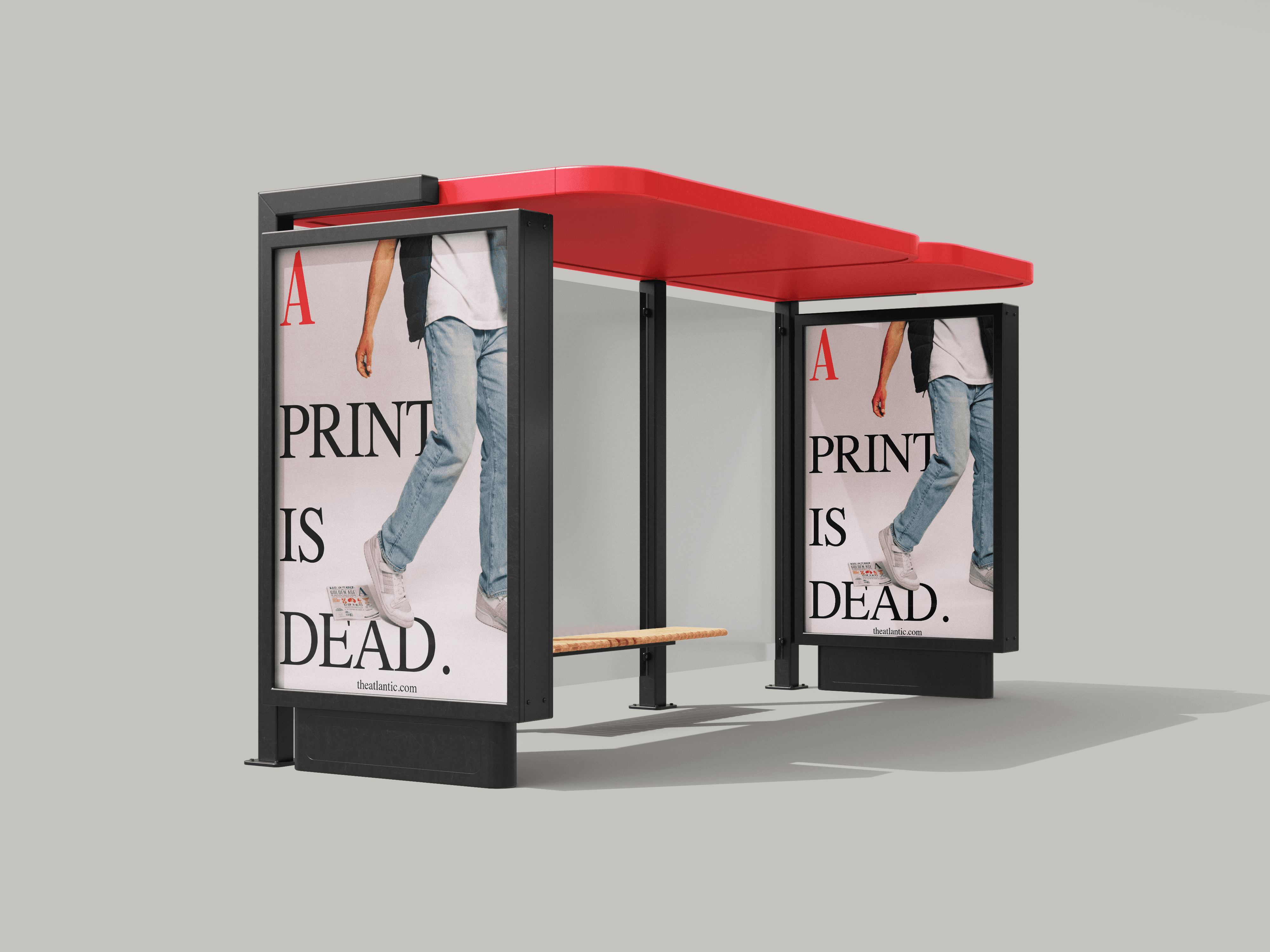
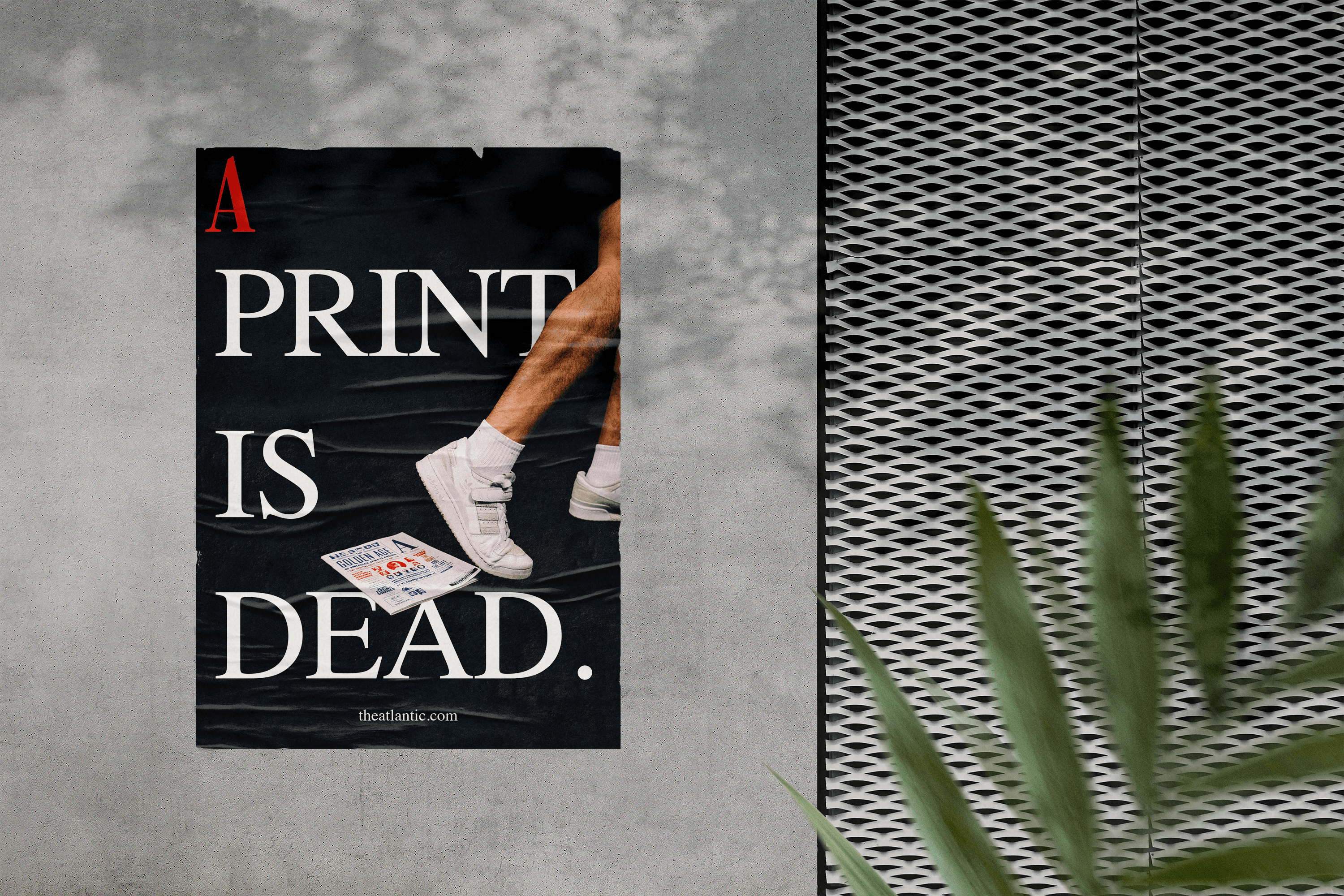
OOH Campaign
OOH Campaign
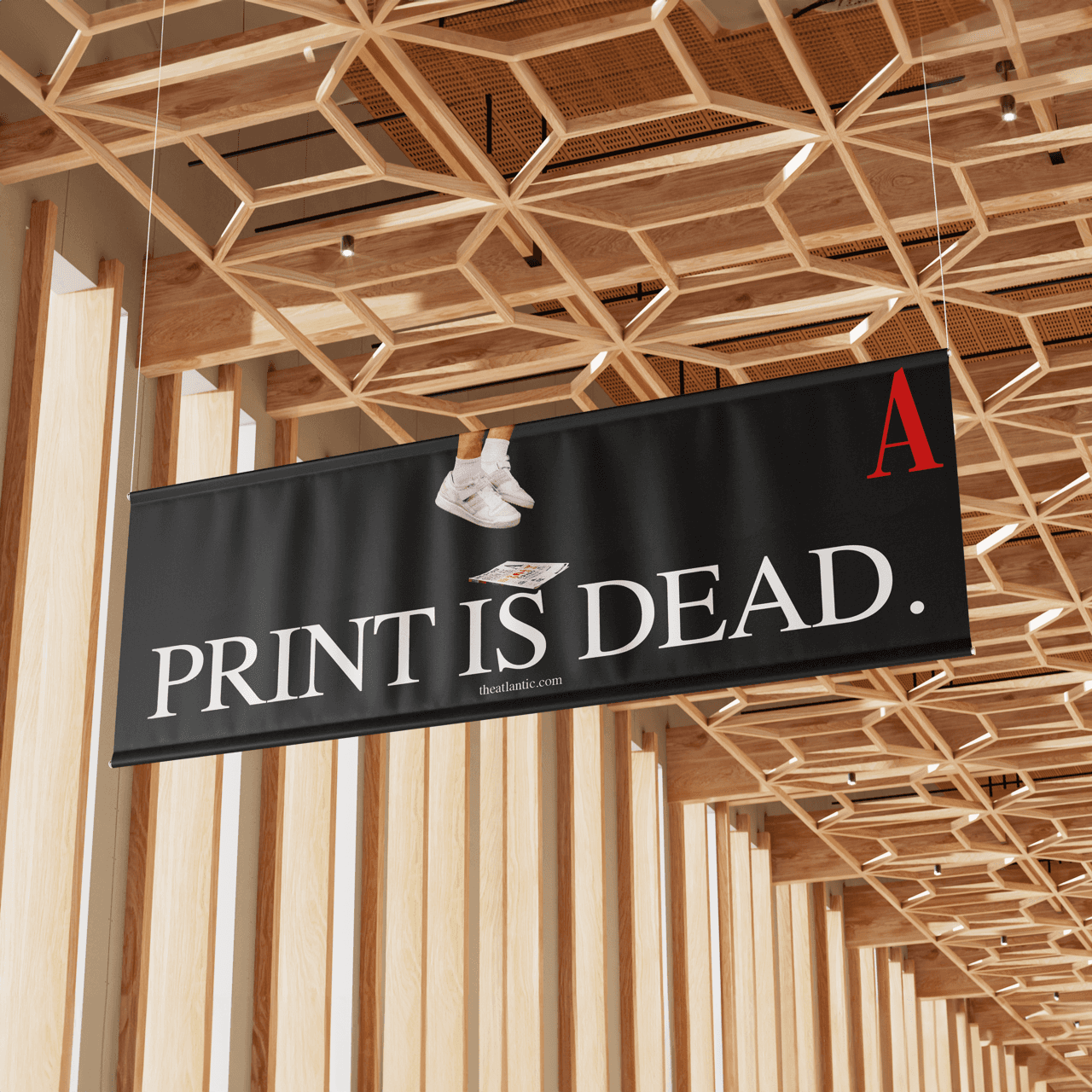
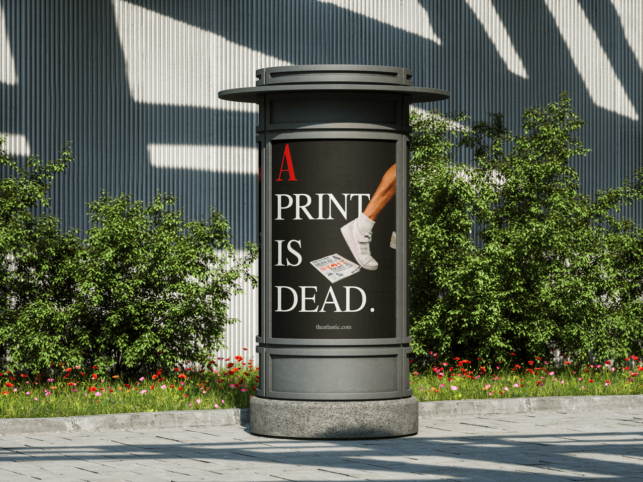
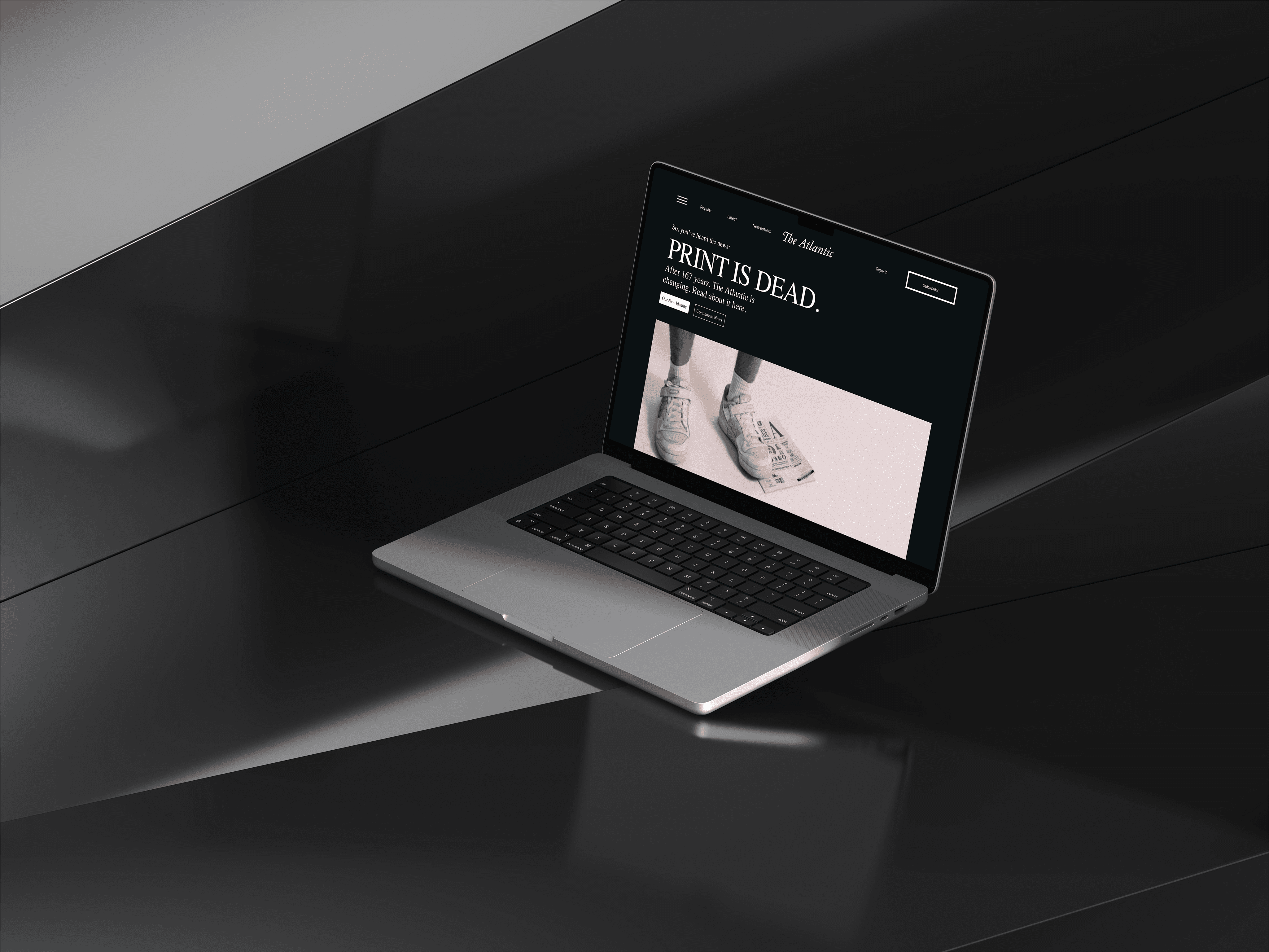
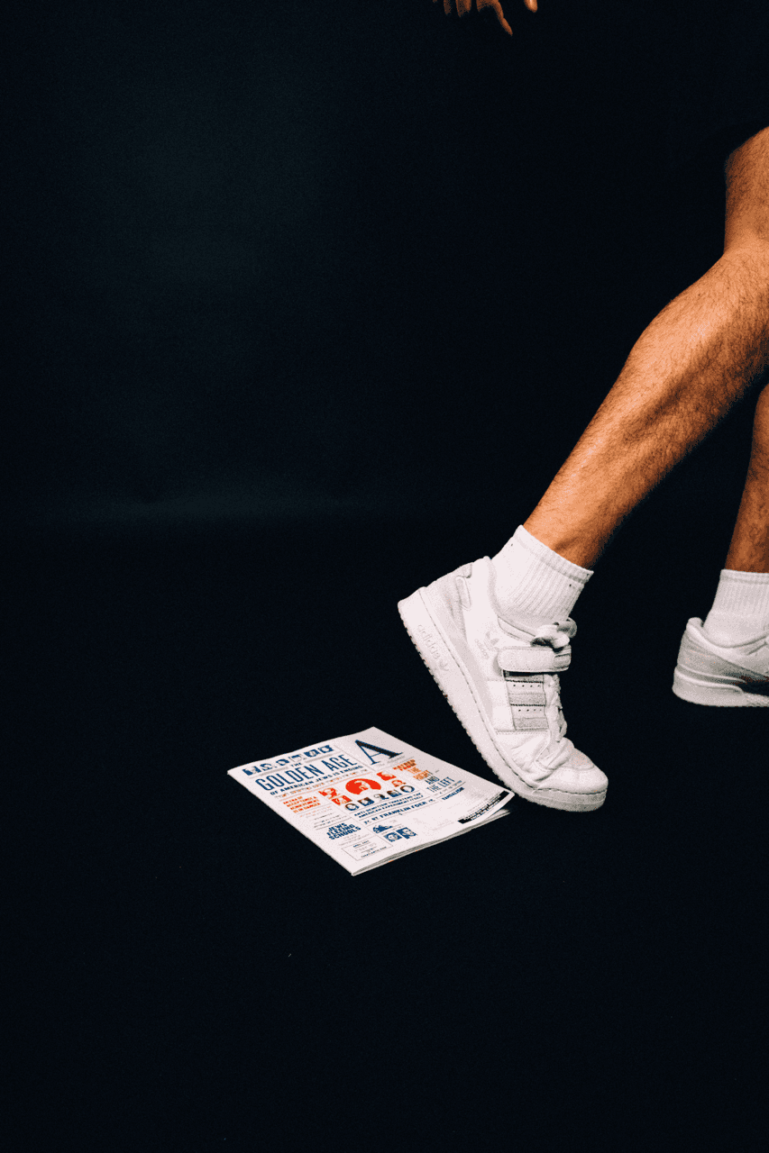
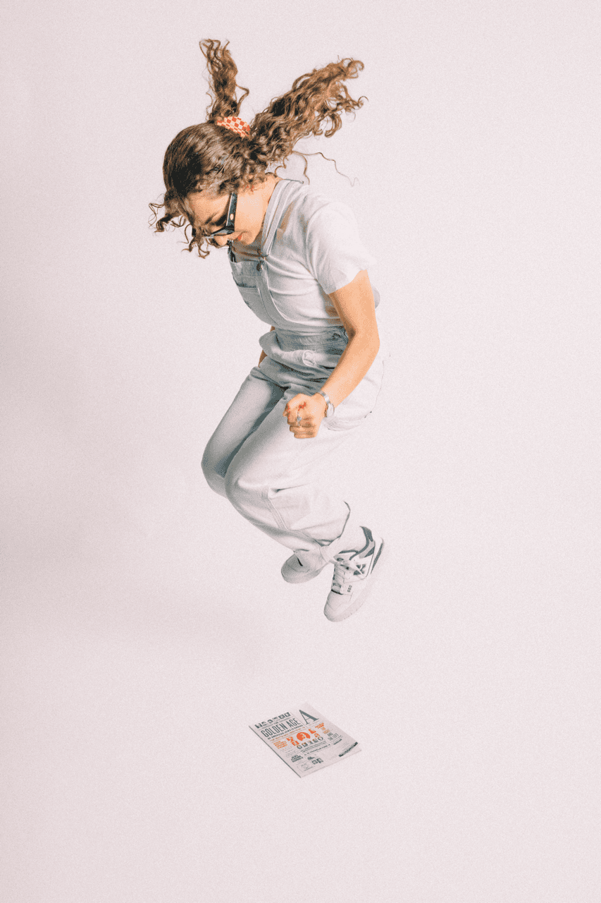
The Atlantic needed a bold way to show audiences their new identity. "PRINT IS DEAD" is an ironic take on the state of print and publishing with recent advances in technology, and designed to point to a timeless publication with the suave to compete in a digital landscape.
The Atlantic needed a bold way to show audiences their new identity. "PRINT IS DEAD" is an ironic take on the state of print and publishing with recent advances in technology, and designed to point to a timeless publication with the suave to compete in a digital landscape.
Development
Development
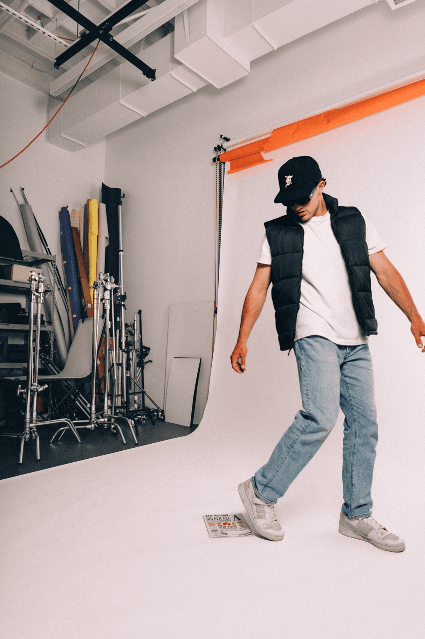
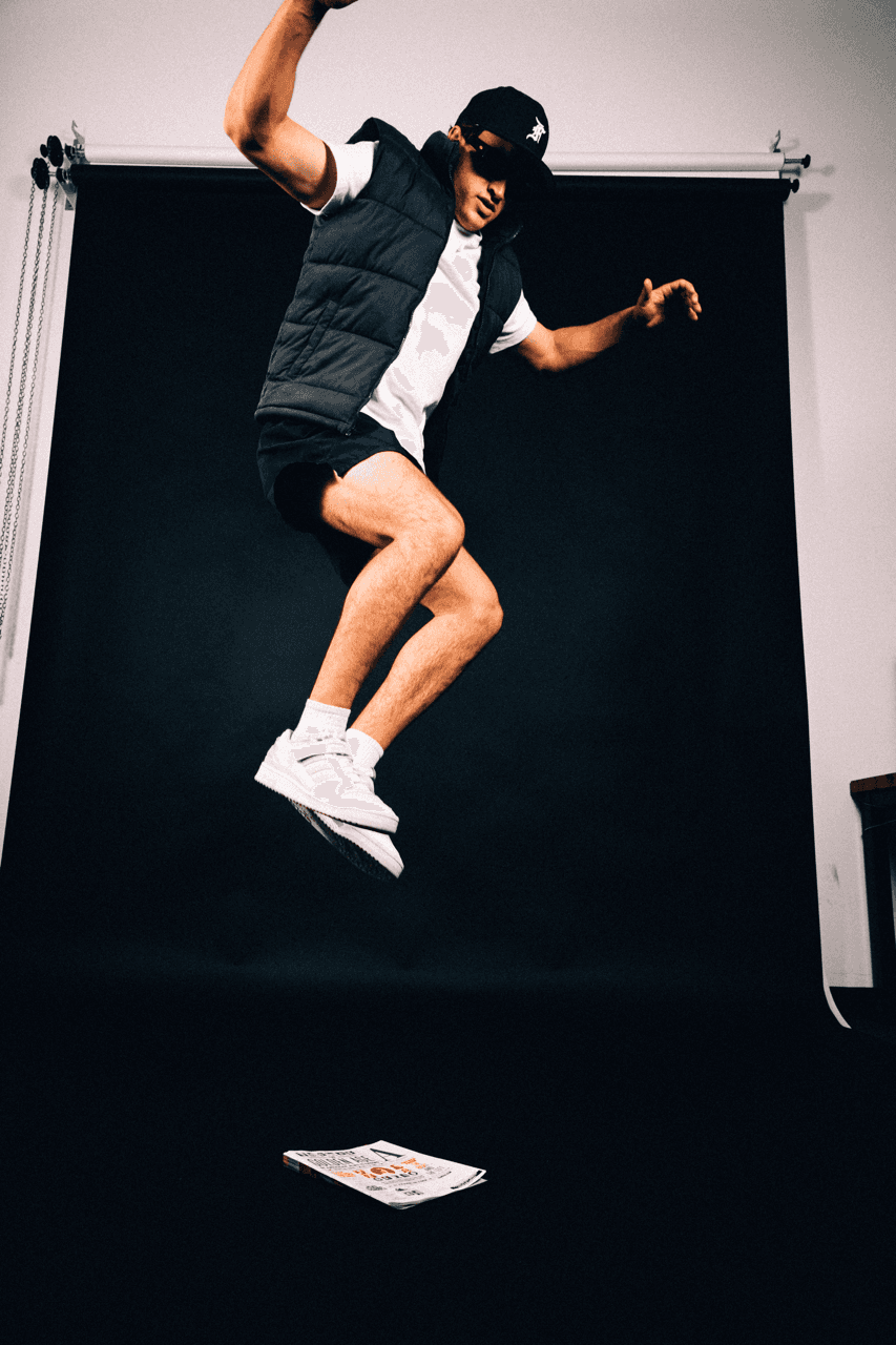
A photoshoot captured the primary content for The Atlantic's campaign titled "PRINT IS DEAD."
Young models were selected to resonate with an audience that spends it's free time on the internet, with an ironic focus on a recent issue and it's destruction.
A photoshoot captured the primary content for The Atlantic's campaign titled "PRINT IS DEAD."
Young models were selected to resonate with an audience that spends it's free time on the internet, with an ironic focus on a recent issue and it's destruction.
Activation
Activation
Social media posts, billboards, and posters were composed and delivered. Depth was added some final designs to create visual interest, and draw viewer's eyes to the model in addition to the highly contrasted text elements.
Social media posts, billboards, and posters were composed and delivered. Depth was added some final designs to create visual interest, and draw viewer's eyes to the model in addition to the highly contrasted text elements.